Behind-the-scenes: Leo Burnett’s Rebranding of Chicago Ideas Week
Chicago Ideas Week (CIW) is sporting a new look as of last Thursday, thanks to the brilliant minds at Leo Burnett.
Alisa Wolfson, senior vice president and group design director at Leo Burnett Chicago, led a team of about four designers over the past month to think out loud and breathe new life into the CIW brand.
We caught up with Wolfson for a behind-the-scenes look into just how the new CIW identity came to be.
Q: Why is branding so important?
Everybody needs a brand. We all have personal brands and things we gravitate to because they make our lives important – whether it’s the places we go or the things we do or the ideas that we’re interested it. A brand stands for the healthy combination of all of those things.
 |
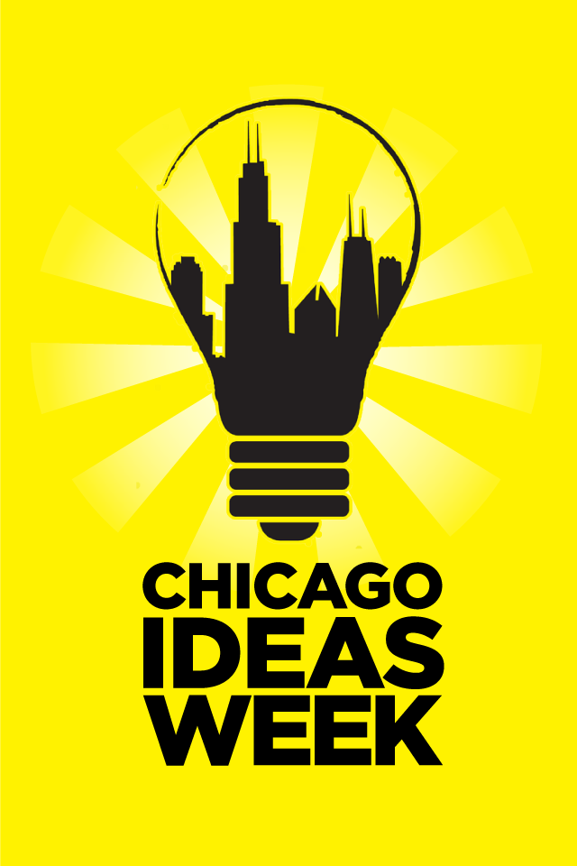
| CIW before. |
Q: How does the new CIW image better reflect its mission?
When we first analyzed the Chicago Ideas Week platform and the pillars of community and activation and connection, the previous logo didn’t really demonstrate any of those. It was more like an icon of what it meant to have an idea in Chicago than an active, thinking, feeling, nimble brand.
We looked at it more from the strategy sense of, “What are we trying to do, what are we actually doing and how can we demonstrate that visually?”
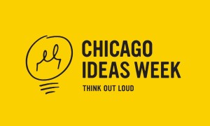 |
| CIW after. |
You see that come out with more of the whimsical, gestural, sketch-like approach that’s just married to a very steady, solid typographic treatment. That really creates the brand – the juxtaposition of these two things.
The brand has a series of sketched icons that can be used for different themes and content, which will keep the logo fresh and interesting. (CIW) can move and play with what kind of messaging they want to convey based on what the content is. That better represents what the actual week is like for people.
Q: Take us inside your world – what did the rebranding creative process look like?
We first assembled a brief based on our initial connection with the folks over at Chicago Ideas Week, and we went through a couple rounds of strategy with them to identify things we could really drill down as far as what the core brand meant to them.
There were five actual concepts and there were three or four designers who worked on different iterations under each. Some of them were very straightforward, while some of them were more whimsy and some a little more divergent, pushing what the idea of a logo was.
We pulled down sketches and put up sketches and revisited things and fell in love with things. There were pieces and parts of other ideas that have been retained as part of this final concept. Gosh, I don’t know how many hours we worked – these are kind of like labors of love.
Our “Aha!” moment was realizing gesture was very synonymous with the frenetic and interesting energy we all experienced at last years’ event.
Q: What is an example of challenge you faced?
We didn’t really want to lose the yellow and black color scheme, so one of our challenges was to try to present that in a new and fresh way – it was after lots of exercises and looking at lots and lots of type treatments to find the perfect one and trying different ways of rendering that icon of the light bulb so it felt fresh. Like it could be anything, and there was a sense of discovery in it.
Q: How do you know when you’ve found the right design?
It feels like they already are that thing and it would be kind of impossible not to do it. It’s just feeling like you’ve found something that you’ve never seen before – and yet, it’s very familiar.
Q: Give us a window into your team’s drive.
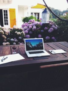 |
| The view from Leo Burnett designer Andy Luce’s workspace in Europe. |
One of the designers, Andy Luce, is a really talented hand-letterer and did all the hand sketches himself with ink. He scanned them in to digitize them so we can all use them. He was actually on his way to do a year sabbatical in the Basque region of northern Spain, closing up their house and getting all their stuff ready.
We were in the process of making all this beautiful work, and he still wanted to be a part of it.
And of course we wanted him to be, too, because his hand and fingerprints are all over the work. So he is actually actively working on it with us from his new life and journey overseas. He has been doing a lot of work on the train as he’s moving from one country to another and hitting all of our deadlines. That’s how passionate the team has been to work on the project.
Q: What’s next as we look forward to Chicago Ideas Week 2013?
We’re in the next-step phase: what do we want to keep, what would be most impactful for this next year and what would make the most difference to people participating? Just trying to demonstrate the brand concept in things that will happen throughout the week – such as when the lectures are happening, what’s going on in that environment?
Everything from the website to printed matter to any kind of additional material that is available to people throughout that week, something that they might be able to hold on to and go back to their lives and reflect on what they learned.
We haven’t homed in on exactly what those pieces will be, but lots of different iterations are on the table and we’re rethinking how we might bring our idea out into the world.
*Editor’s note: This interview has been edited down from its original form.


